Insert Variables
Examples
<div class="sui-form-field">

	<label class="sui-label">Field label</label>

	<div class="sui-insert-variables">

		<input type="text" class="sui-form-control" placeholder="New inquiry from {first-name}" />

		<select id="unique-id" class="sui-variables">
			<option value="variable-1">Variable 1</option>
			<option value="variable-2">Variable 2</option>
			<option value="variable-3">Variable 3</option>
			<option value="variable-4">Variable 4</option>
			<option value="variable-5">Variable 5</option>
		</select>

	</div>

</div>
Use data-search="true" to enable search input on dropdown list.
Usage
Insert Variables
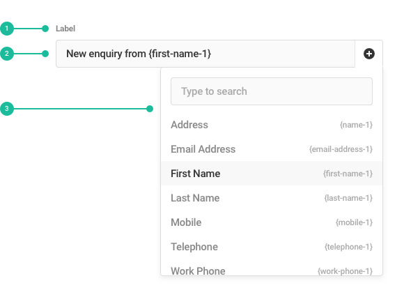
This type of select is commonly used when inserting structured variables into emails and subject headings, etc. The user simply clicks the options in the dropdown to add them.
Anatomy

- Label: Labels should be sentence case as short as possible while clearly explaining the content of the menu.
- Insert Button: Text input is accompanied by select button at right. User should click on it to display the menu and pick an option to insert into the input.
- Menu: Contains the list of all items that can be inserted. These can be grouped into sub-categories under headings too. Each item will be accompanied by the option value.
Best Practices
- Order your list of options in a way that will make the most sense to the user.
- Remove options that rarely get used.
- Don't overwhelm the user with too many options.
Content Guidelines
- Use concise and descriptive labels so that users clearly know the purpose of the selection. For example, use a "Save to..." label for a list containing options such as "Cloud, Local drive, CD".
- Keep options to a single line of text.
- Use commonly known terms for your options, make sure they're clear and direct.
Code
Styles
// Include all components' styles.
@import "shared-ui";

// Include styles for this component only.
@import "~@wpmudev/shared-ui/scss/select2";
@import "~@wpmudev/shared-ui/scss/insert-variables";
Note: When importing component styles only you will also need to import functions, colors, variables, and other basic files that work together with select file.
JavaScript Instantiation
This is the basic configuration to initiate select element for insert variables component.
Default
SUI.select.initVars( $( '#unique-id' ) );
Custom
Usually when don't need basic configuration and need to pass additional data through JS.
let getParent    = select.closest( '.sui-modal-content' ),
	getParentId  = getParent.attr( 'id' ),
	selectParent = ( getParent.length ) ? $( '#' + getParentId ) : $( document.body ),
	hasSearch    = ( 'true' === select.attr( 'data-search' ) ) ? 0 : -1;

$( '#unique-id' ).SUIselect2({
	theme: 'vars',
	dropdownParent: selectParent,
	templateResult: SUI.select.formatVars,
	templateSelection: SUI.select.formatVarsSelection,
	escapeMarkup: function( markup ) {
		return markup;
	},
	minimumResultsForSearch: hasSearch
});
By adding sui-variables class there's no need for any JavaScript instantiation but if you need to pass data through JS or any other configuration, you can do it by using .SUIselect2( 'destroy' ) before calling again .SUIselect2() with your default configurations.
Configuration
To configure custom options when you initialize SUIselect2, simply pass an object in your call to .SUIselect2().
JS options
This is a list with the most common SUIselect2 configuration options.
| Option | Type | Default | Description | ||
|---|---|---|---|---|---|
dropdownParent |
jQuery selector or DOM node | $( document.body ) |
Allows you to modify where dropdown is going to be placed. Use this option when select is placed inside modals. | ||
templateResult |
callback | Customizes the way that dropdown options are rendered. Use SUI.select.formatVars to show an icon button instead of selected option. |
|||
templateSelection |
callback | Customizes the way that selections are rendered. Use SUI.select.formatVarsSelection to show option label followed by its value. |
|||
escapeMarkup |
callback | Utils.escapeMarkup |
Handles automatic escaping of content rendered by custom templates. | ||
Since SUIselect2 is based on Select2, you can find more configuration options listed here.
data-* attributes
It is recommended that you declare your configuration options by passing in an object when initializing SUIselect2. However, you may also define your configuration options by using the HTML5 data-* attributes, which will override any options set when initializing SUIselect2 and any defaults.
| Attribute | Default | Description | ||
|---|---|---|---|---|
data-theme |
Enables markup and styles for different select styles. Use vars value to enable insert variables styles for select button. If you already passed this data through theme JS code, there's no need to call this data again. |
|||
data-placeholder |
Make use of this attribute followed by an empty <option> at the beginning of the options' list. |
|||
data-search |
false | Use true value when you need to enable search input on dropdown list. |
||